30 day chart challenge: 2023
30 day chart challenge 2023
In reverse chronological order.
Day 29: Monochrome.
I really liked this one! I used Quarto to apply R and Python functions to the same dataset.
Data: EU BUCCO.
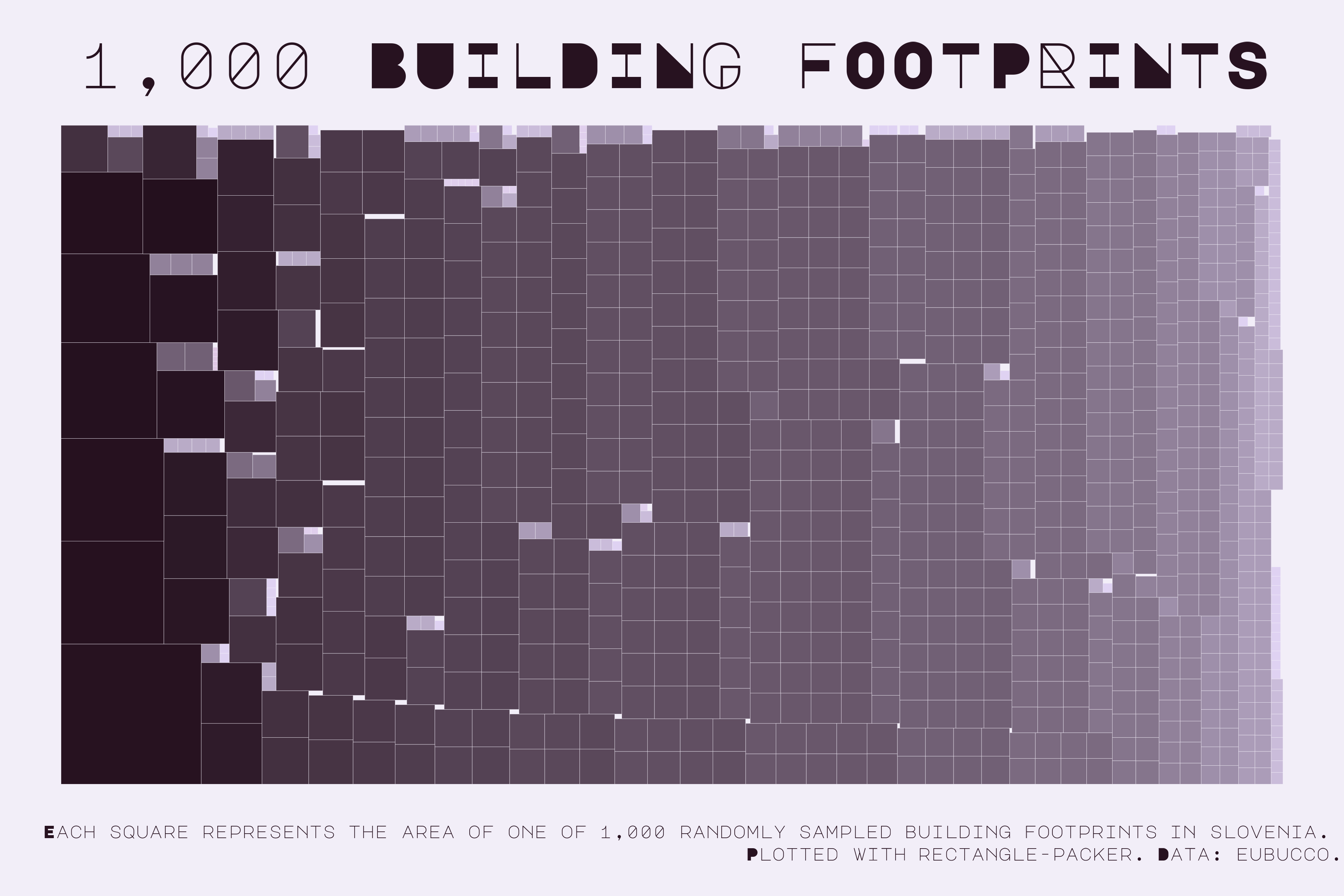
The full write-up can be found here.
Day 23: Tiles.
Sentiment analysis of Kurt Vonnegut’s Slaughterhouse-Five.
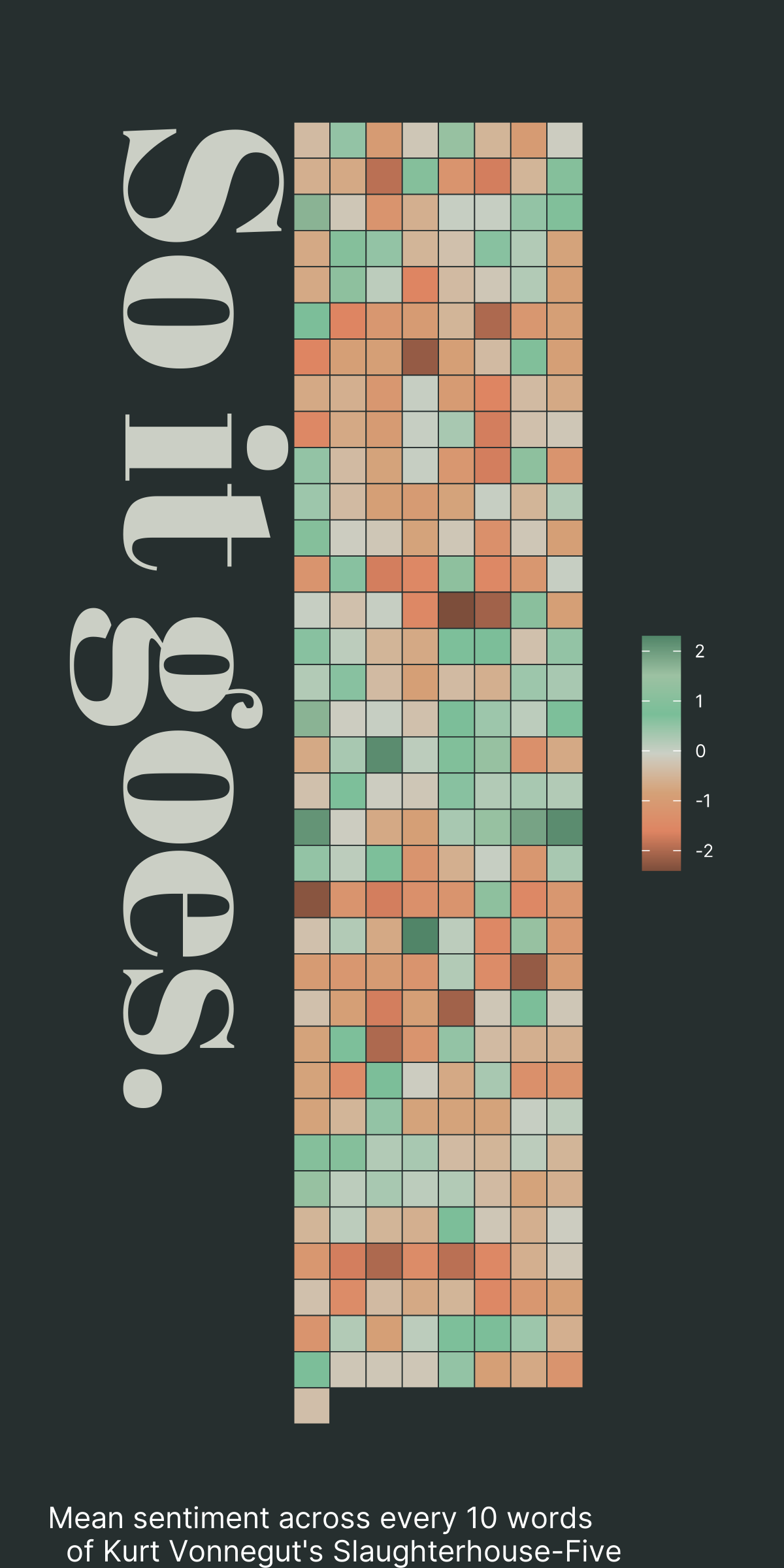
Interactive version below, or you can click here (I know the formatting is a bit off).
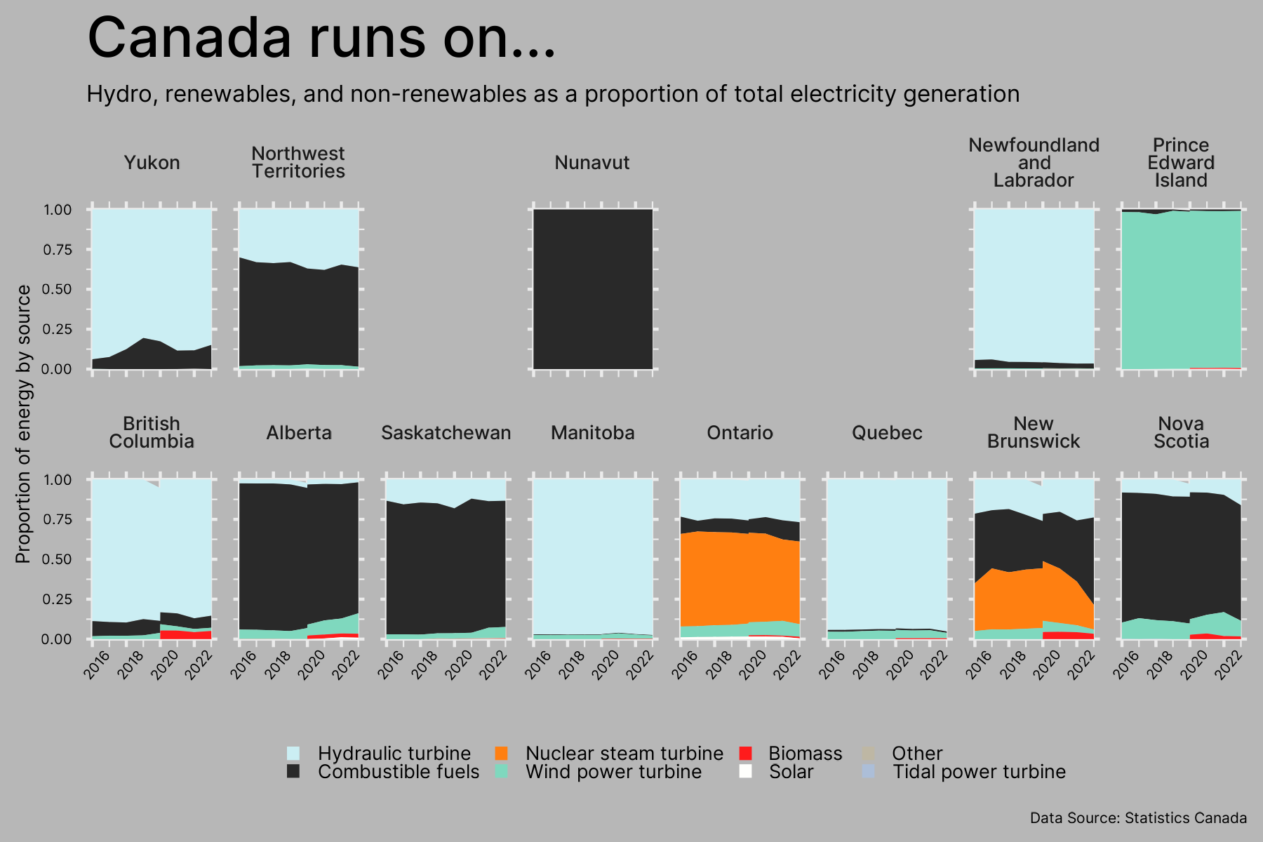
Day 22: Green Energy.
Sources of Canadian energy, split by province.
Data: StatCan.
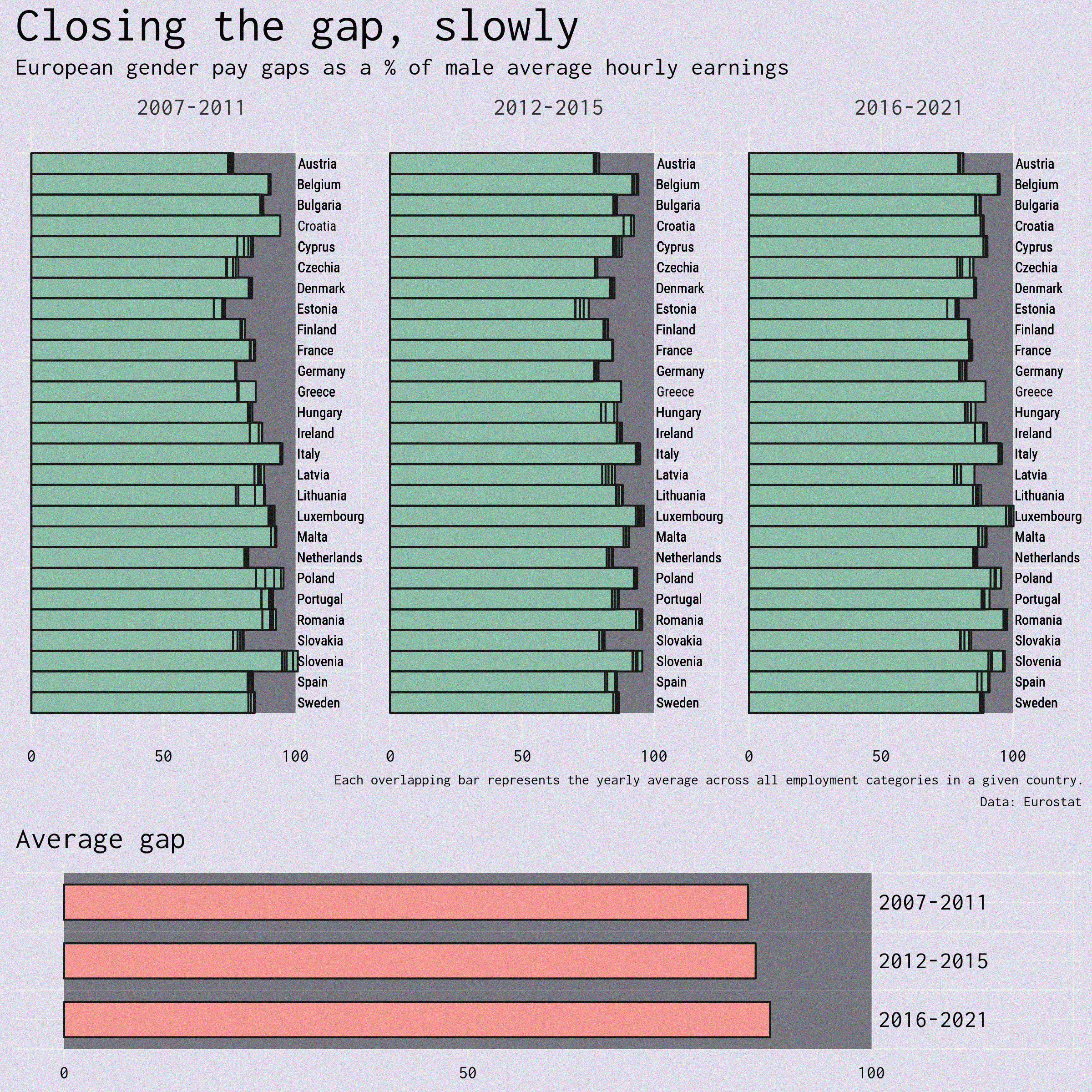
Day 18: EuroStat.
Gender pay gaps in Europe over time, split by country.
Data: Extracted using the eurostat R package.
Day 14: New Tool.
I used Flourish to visualize a few of my recent bakes.
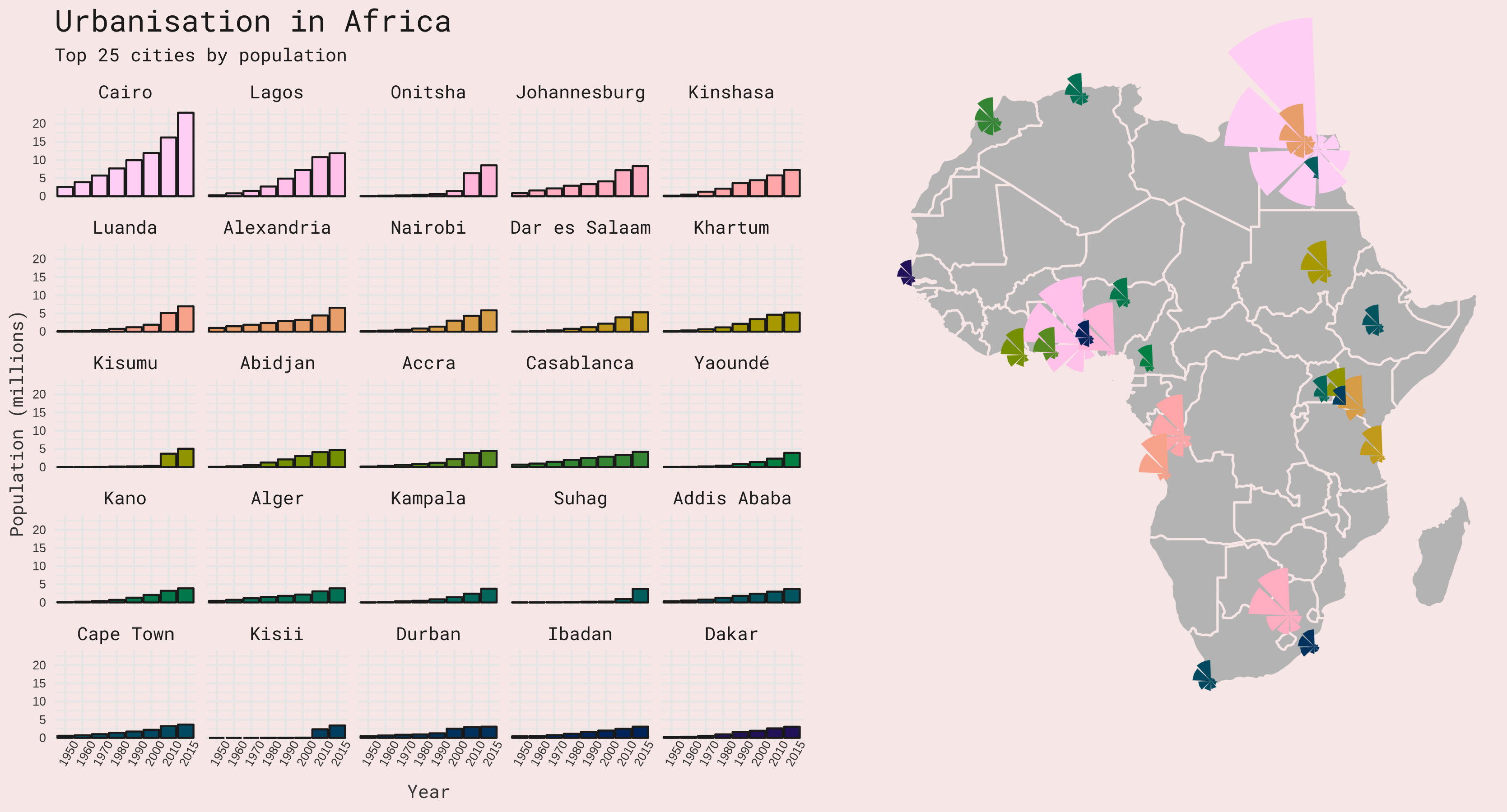
Days 10 & 11: Hybrid & Circular.
A hybrid chart/map plot of urbanization in the top 25 most populated African cities over time.
Data: Africapolis.
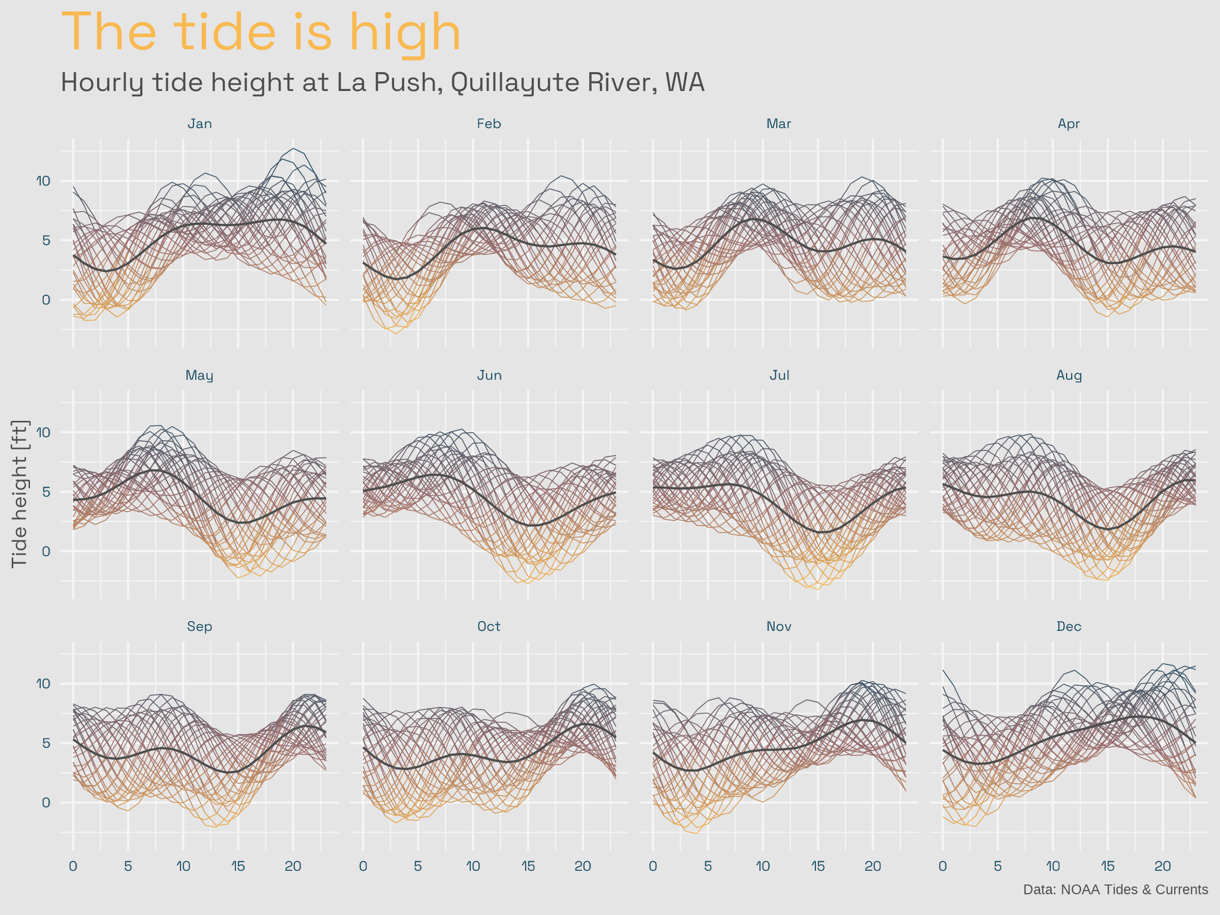
Day 9: High/Low.
The ebbs and flows of oceanic tides in the Olympic Peninsula, Washington state.
Data: NOAA Tides & Currents.
Day 7: Hazards.
‘Hazard’ interpreted here as ‘danger’. Endangered and disappearing languages of the world.
Data: Endangered Languages Project.
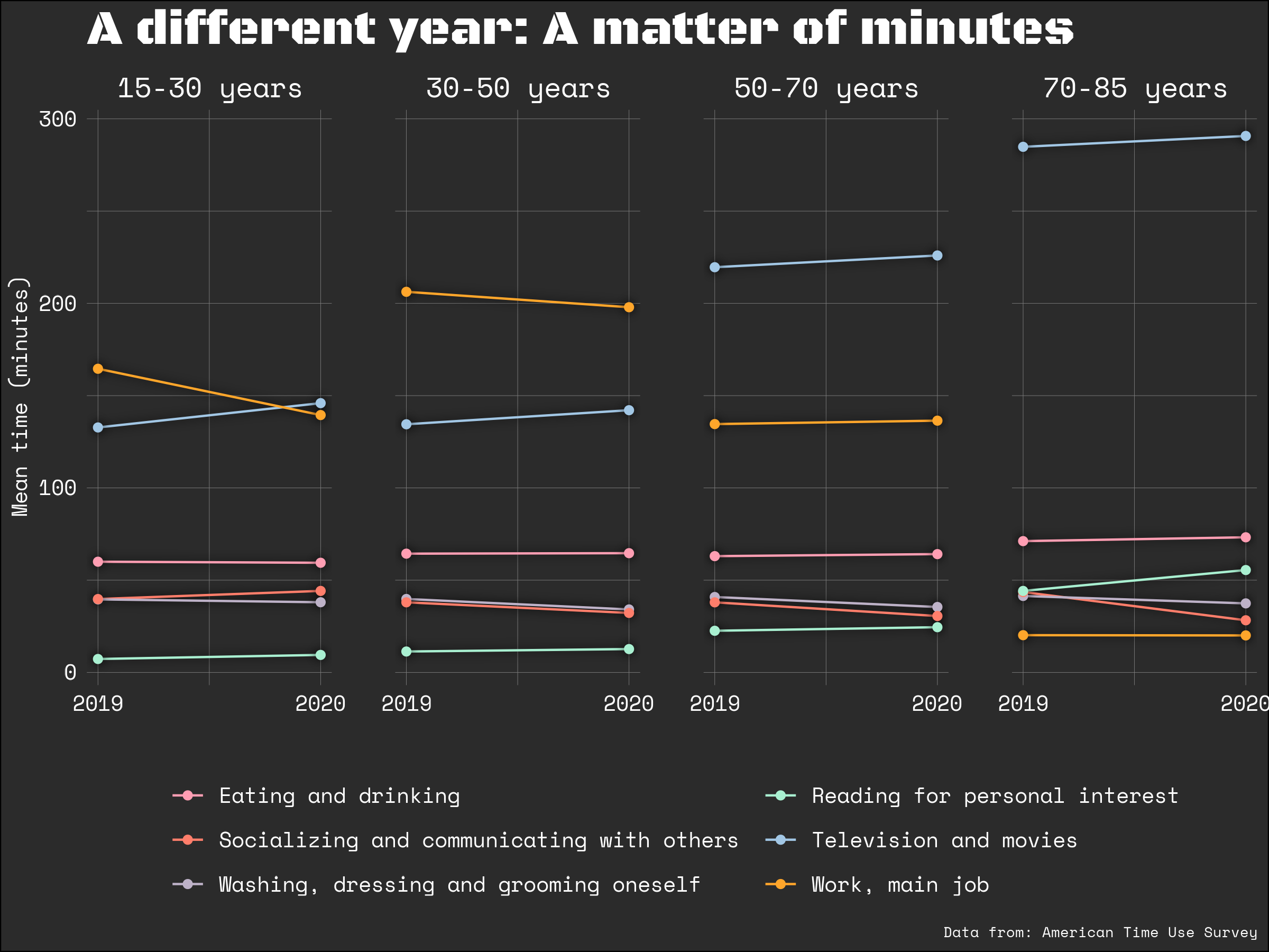
Day 5: Slope.
Differences in Americans’ time-use between 2019 and 2020, split by age and activity.
Data: American Time Use Survey.
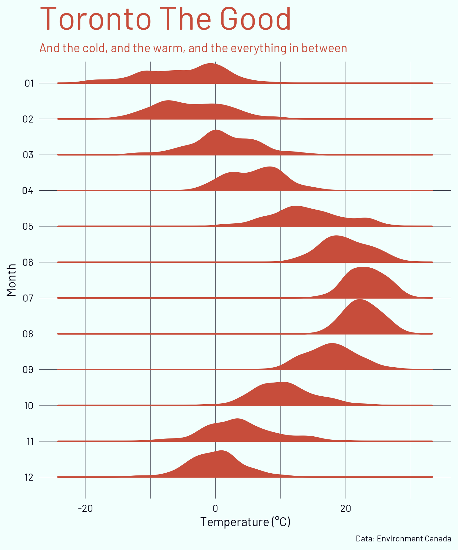
Day 4: Historic.
5-years of temperature data for each month of the year in Toronto.
Data: Weather Canada.
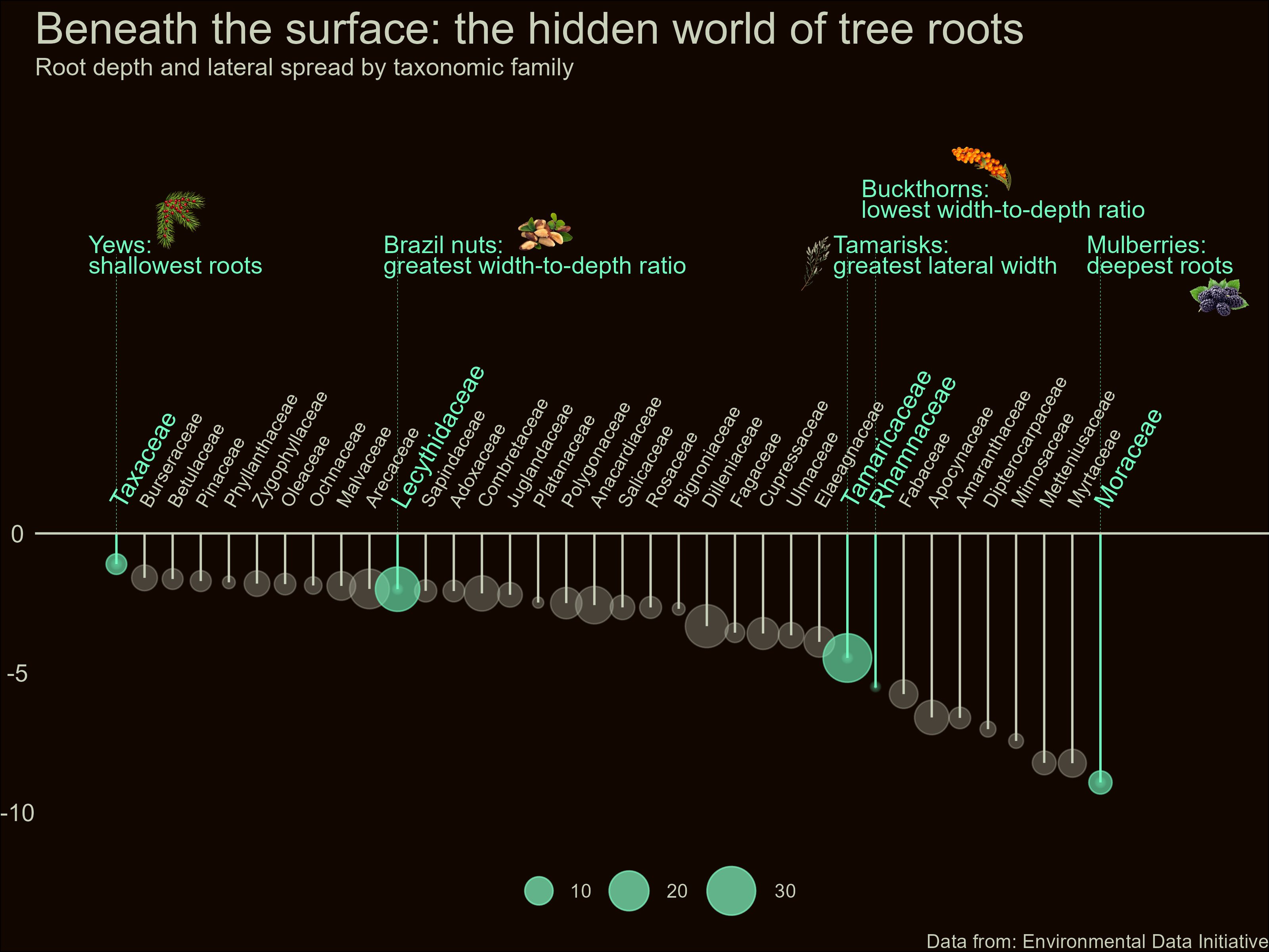
Day 3: Flora & Fauna.
The depth and lateral spread of roots in different tree families.
Data: Environmental Data Initiative.
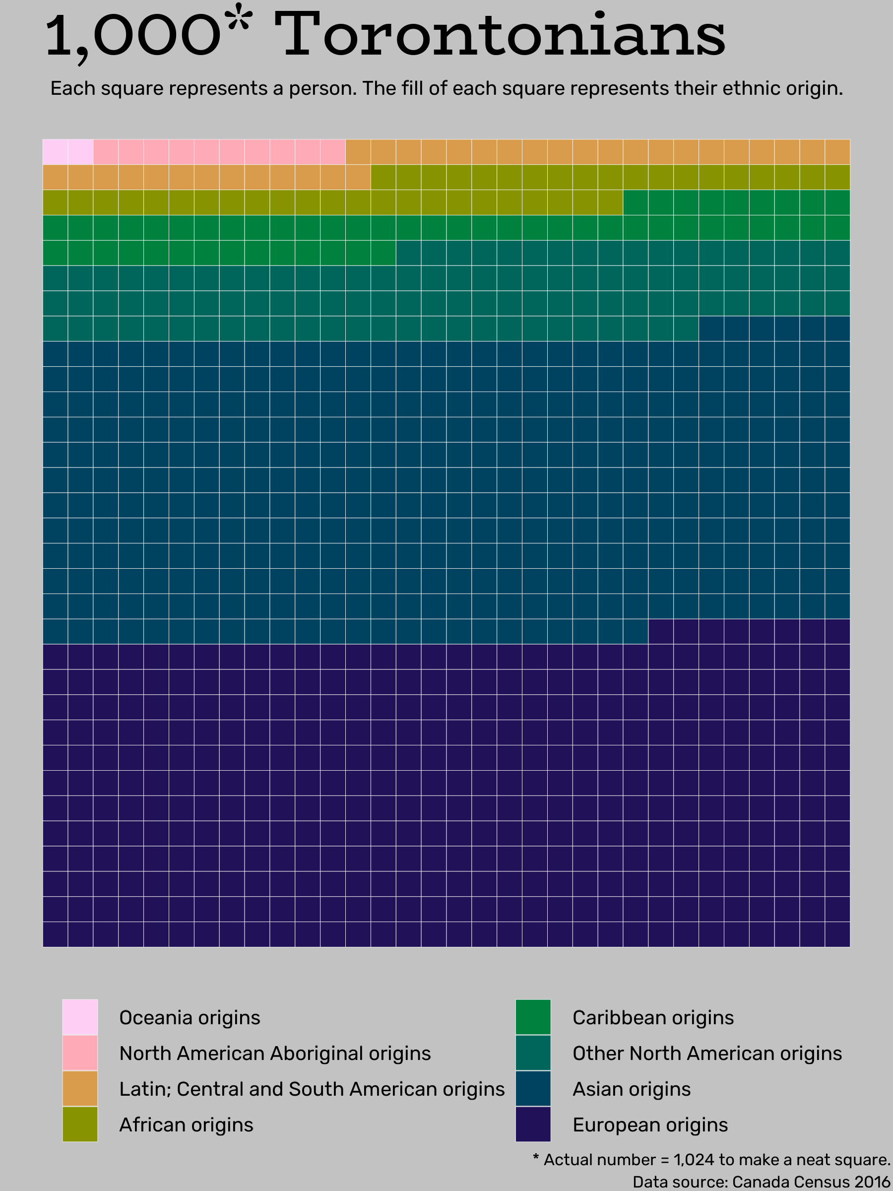
Day 1: Part-to-whole.
Self-reported ethnic origin of 1,024 randomly sampled Torontonians.
Data: Census Canada.