Visualizing building footprint areas
This Quarto doc walks through the steps of porting data over from R to Python and back again: extracting the data, applying an area-packing algorithm to it, and then visualizing it.
Load the data
Read in the data from the EUBUCCO website (this takes a relatively long time):
library(sf)
dat_full <- read_sf('v0_1-SVN.gpkg')
This dataset is > 1 million rows. For the purposes of this visualization, I’m only taking 1,000 randomly sampled rows:
dat <- dat_full[sample(nrow(dat_full), 1000), ]
Calculate area of each polygon
Each row in the geom column contains a polygon. We can use an sf package function to calculate the area of each polygon and save it in a separate column. For plotting, we’ll assume each polygon is a square (which it isn’t) and save the sides of the square as well.
library(dplyr)
dat$area <- st_area(dat$geom)

dat <- dat |>
  mutate(side_x = sqrt(area), side_y = sqrt(area)) |>
  st_drop_geometry() |>
  # save only coordinates to pass on to python
  select(side_x, side_y)

dat$side_x <- as.numeric(dat$side_x)
dat$side_y <- as.numeric(dat$side_y)

library(knitr)
kable(head(dat))
Rectangle packing
Now, we pass these data to Python and use the rpack library to derive coordinates to pack rectangles into a plot:
dat_py = r.dat
# round to nearest integer, otherwise the rpack function doesn't work
dat_py = round(dat_py, 0).astype(int)

# convert to list of arrays
dat_list = dat_py.values.tolist()

import rpack
import pandas as pd
import numpy as np

positions = rpack.pack(dat_list)

positions = pd.DataFrame(np.row_stack(positions))
positions.columns = ['x_coord', 'y_coord']

positions = pd.concat([positions.reset_index(drop=True), dat_py], axis=1)
Visualization
Port the Python results back to R and visualize.
library(reticulate)
library(ggplot2)
library(showtext)
library(ggtext)
data_coord <- py$positions
# combine the two dataframes
#data_final <- cbind(dat, data_coord)
data_coord$x_end = data_coord$x_coord + data_coord$side_x
data_coord$y_end = data_coord$y_coord + data_coord$side_y
# this is slightly stupid, but whatever. recalculate the area
data_coord$area <- data_coord$side_x * data_coord$side_y
color_scale <- c(
"#271220",
"#24101e",
"#574557",
"#a192ad",
"#e0d3f3",
"#e0c8e5"
)
font_add_google(name = 'Major Mono Display', family = 'MajorMono')
showtext_auto()
ggplot() +
geom_rect(data = data_coord,
aes(xmin = x_coord, ymin = y_coord,
xmax = x_end, ymax = y_end,
fill = log(area)), color = '#F2eef8',
linewidth = .08) +
scale_fill_gradientn(colours = rev(color_scale)) +
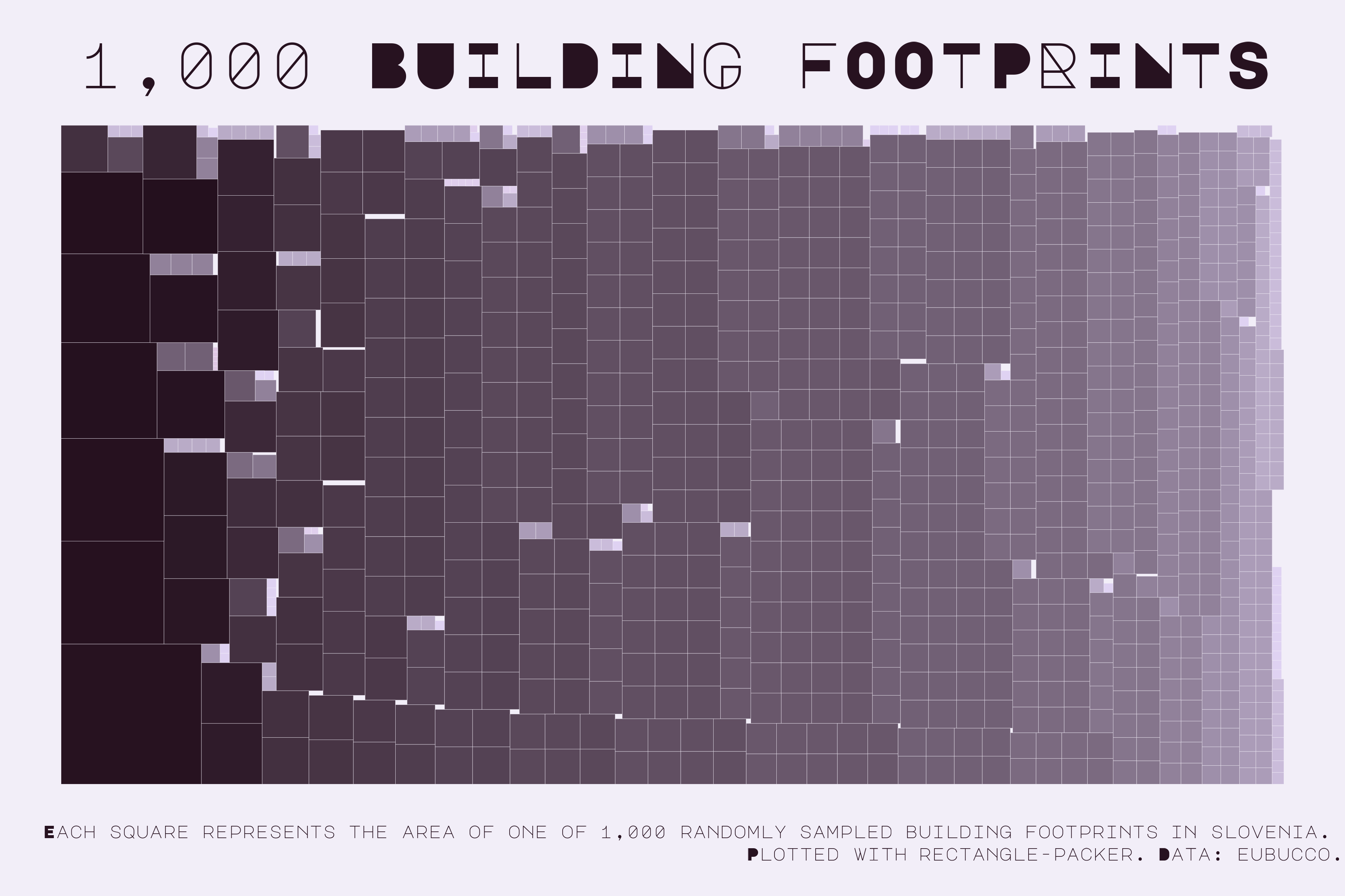
labs(title = '1,000 BUILDING FOOTPRINTS',
caption = 'Each square represents the area of one of 1,000 randomly sampled building footprints in Slovenia. <br>Plotted with rectangle-packer. Data: EUBUCCO.\t') +
coord_fixed() +
theme_void() +
theme(legend.position = 'none',
plot.background = element_rect(fill = '#F2eef8', color = NA),
plot.title = element_text(size = 130, family = 'MajorMono',
color = '#271220', hjust = 0.5),
plot.caption = element_markdown(lineheight = .4,
size = 36,
family = 'MajorMono',
color = '#271220'))
Save the plot:
ggsave('monochrome_viz.png', width = 12, height = 8, dpi = 300)