30 day map challenge 2022
Just like last year, I took part in the 30 day map challenge.
Writing this is a bit disorienting. They're just maps, but the condensed month-long sprint makes it hard not to reflect on last year's experience.
My personal map has changed so much. Last year's maps were created while I was a postdoc, still mostly isolated from the world, in my old apartment in Philadelphia.
This year's maps, in a world that mostly feels back to normal, in my new apartment in Toronto, a place I mostly know, but still feel a stranger to.
On a different trajectory entirely. So, disorienting.
But who cares where north is, really, when you're navigating a new planet?
Anyway, I really enjoyed this year's challenge. I spent a lot of the past year trying to understand how people find their way in the world.
My map entries for this year's challenge were a bit abstract, but I'm always curious about trying to find ways to map moment-to-moment experience onto a static plane as closely as possible.
The development I'm most proud of this year is getting better at 3D rendering and generally understanding spatial data better. I was generally able to work faster, which made it possible to experiment more with my colour palettes and visualizations.
I love maps, and I'm already excited for next year's challenge.
Day 1: Points. Toronto Tree Inventory.
Visualizing trees by species in the city of Toronto. I limited the visualization to top 10 species, but it was fun to explore thousands of data points. Data: Open Data Toronto.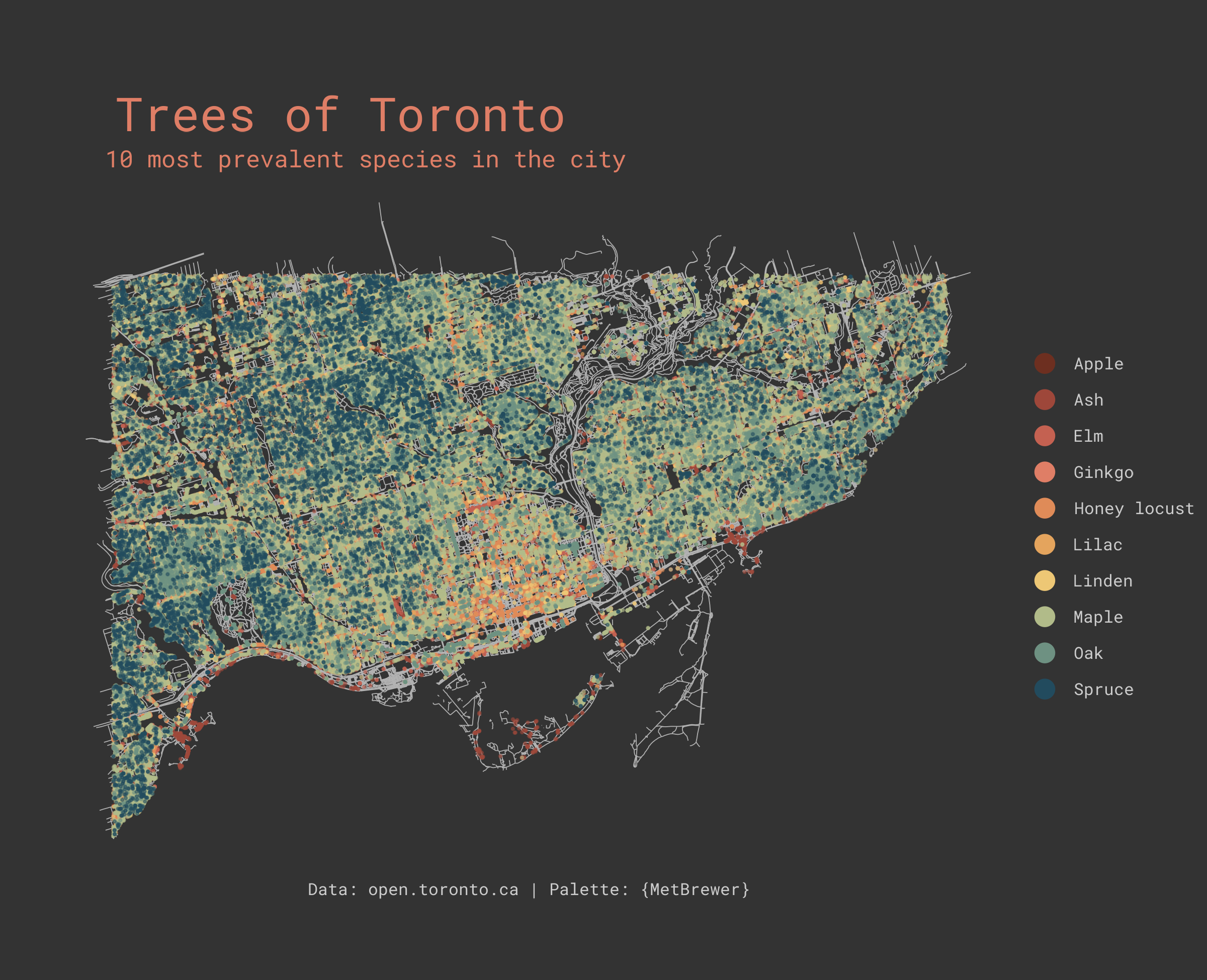
Day 2: Lines. Elevation of Canada.
Visualizing the elevation of Canada across latitude lines in the form of a joyplot.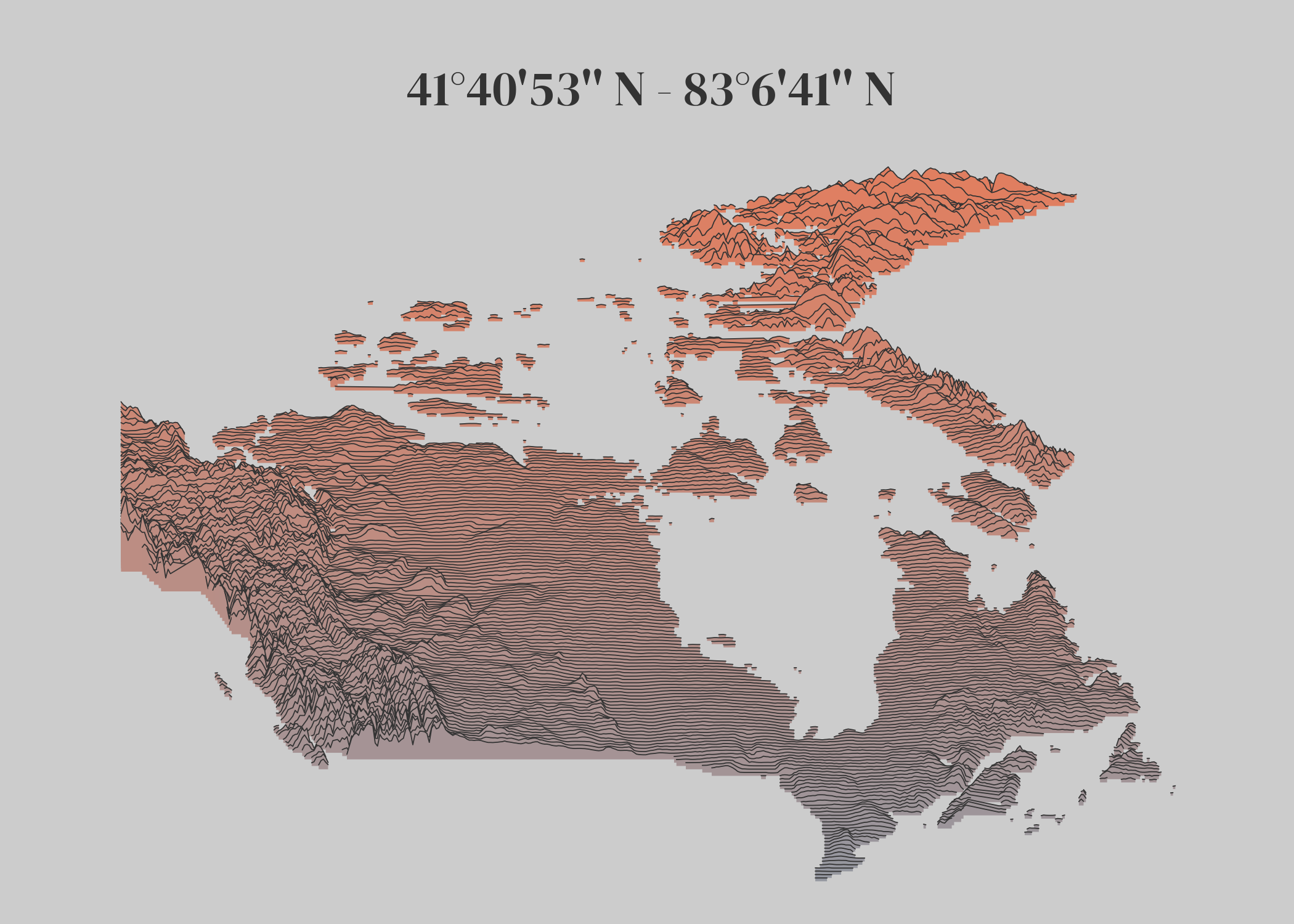
Day 3: Polygons. Olfactory accuracy of Americans.
In 1986, National Geographic assessed how capable Americans were of discerning different scents vs. their self-rated ability to discern different scents. Data: Pyrfume Data.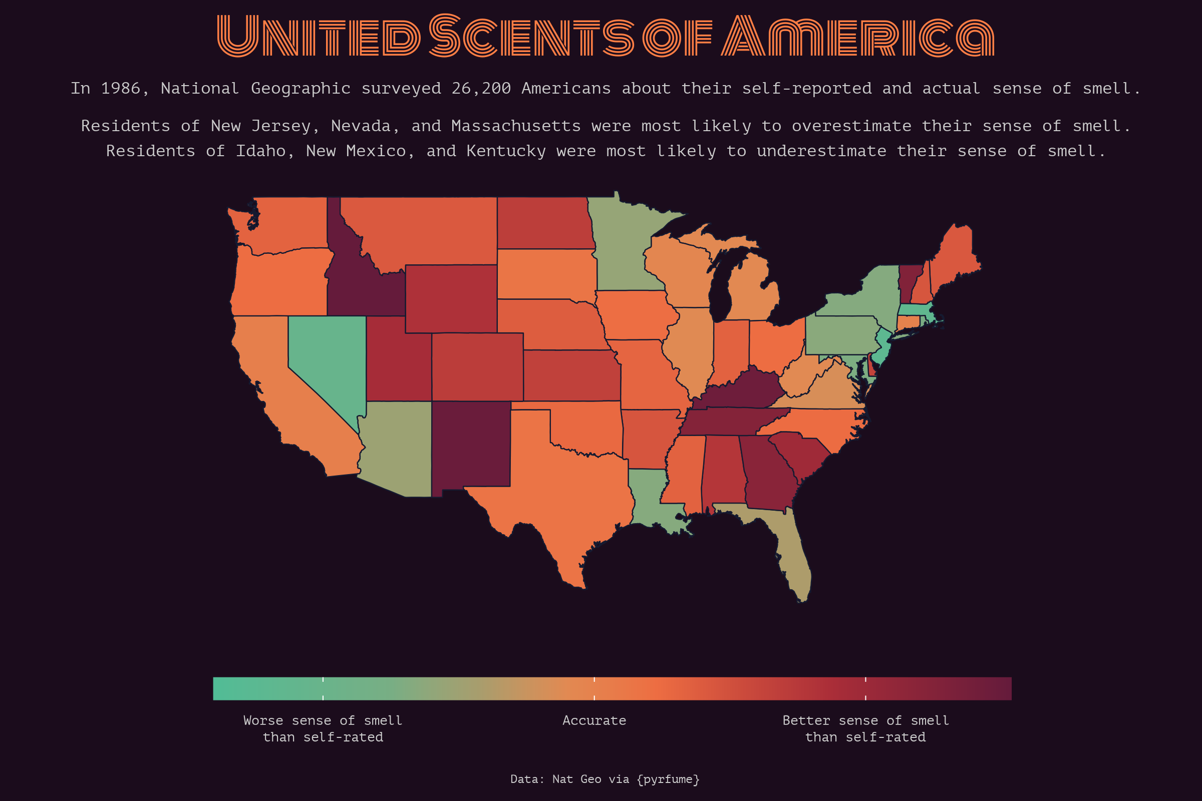
Day 4: Green. Green spaces in NYC.
Plotting every green space (park, meadow, wood) in NYC.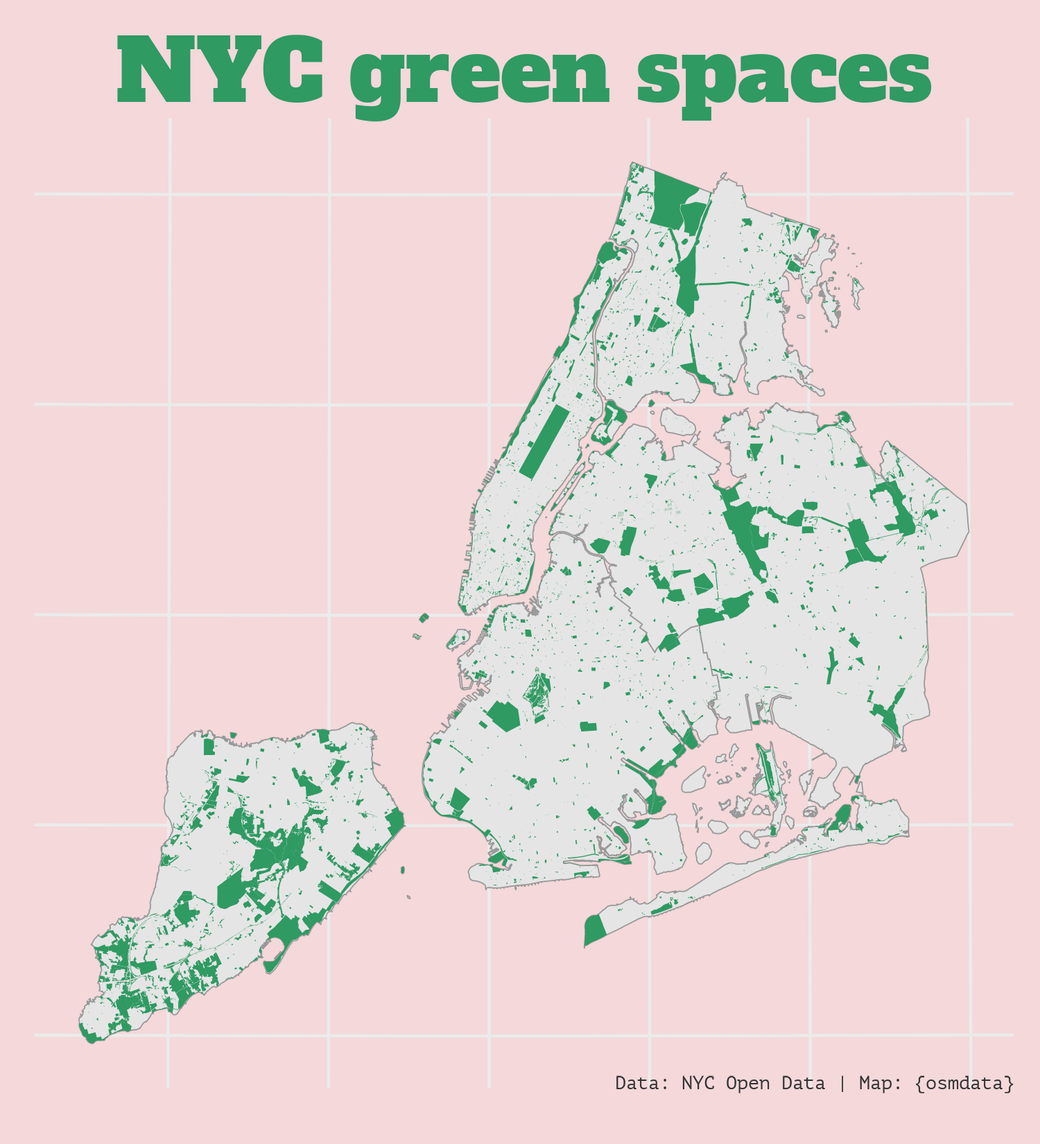
Day 5: Ukraine. 3D relief render of Ukraine.
Using rayshader to render the elevation of Ukraine.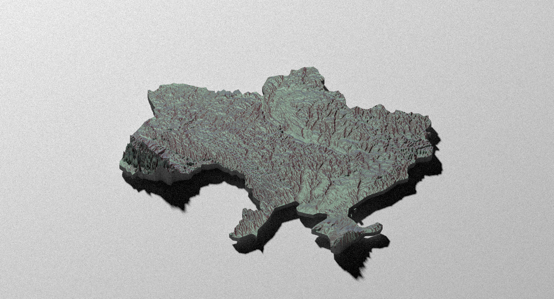
Day 6: Network. Daily in-out patterns on the Tube.
Entry and exit patterns on the London Underground network. Data: oobrien on Github.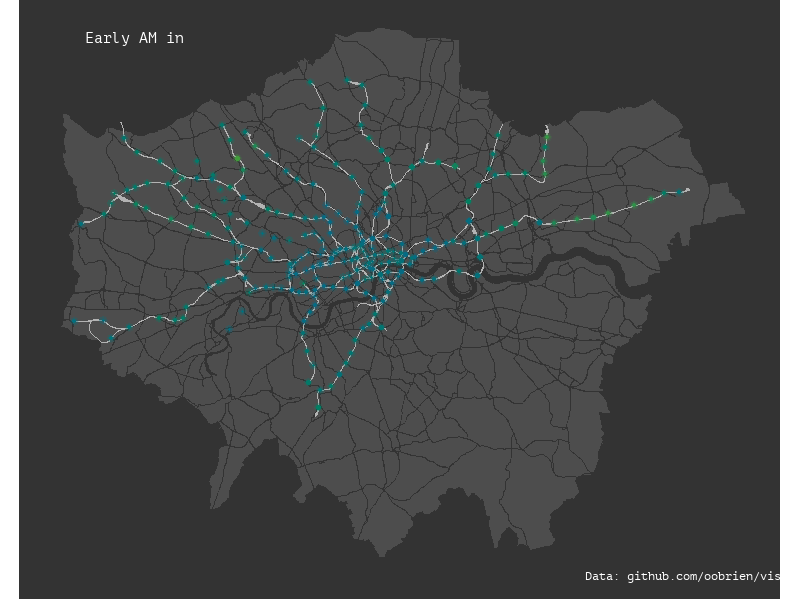
Day 7: Raster. Forest coverage of Bhutan.
Blocky raster style in rayshader depicting forest coverage of Bhutan. Data: UMD.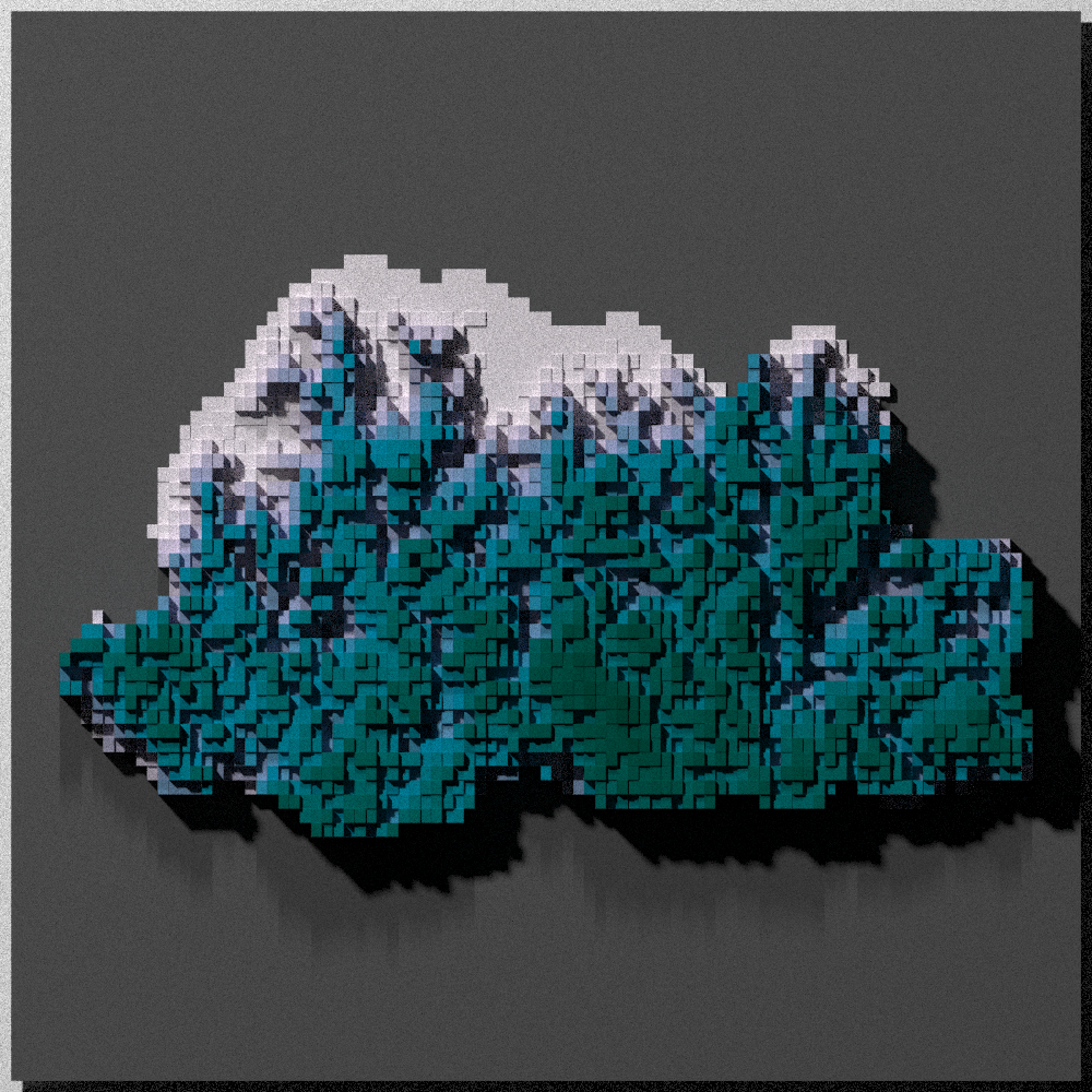
Day 8: OpenStreetMap. A map of Ljubljana.
A map of old town Ljubljana using OSM data.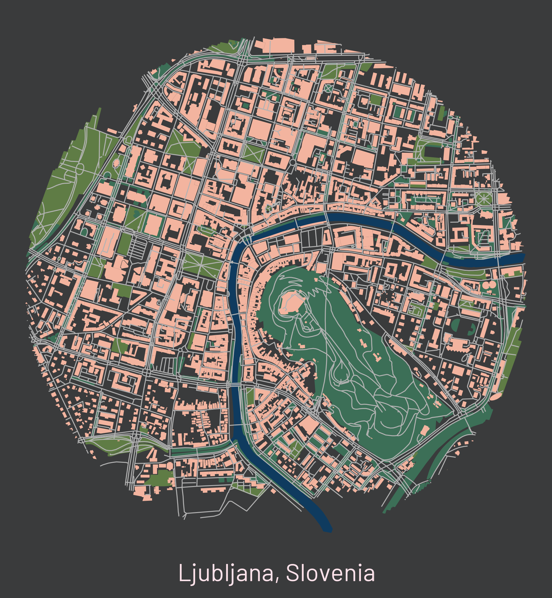
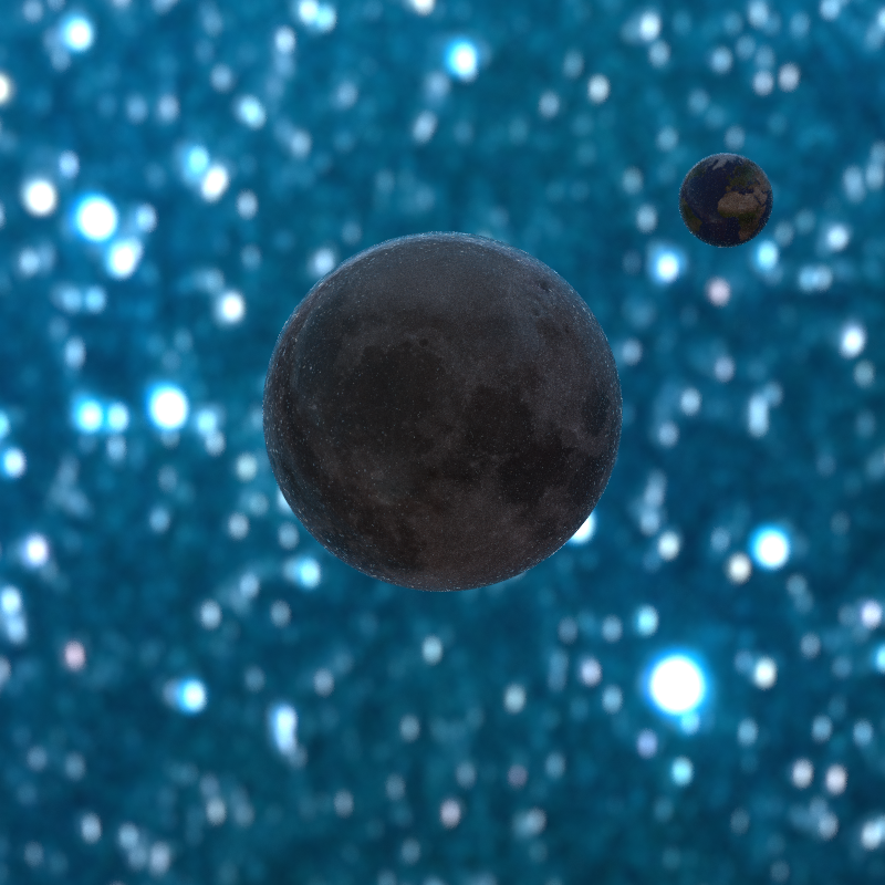
Day 9: Space. Imaginary Earth & Moon.
Using rayrender to swap the Earth and the Moon.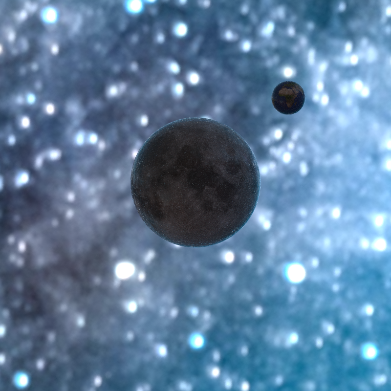
Day 10: A Bad Map. A map of Bad places in Austria.
Data: GeoNames.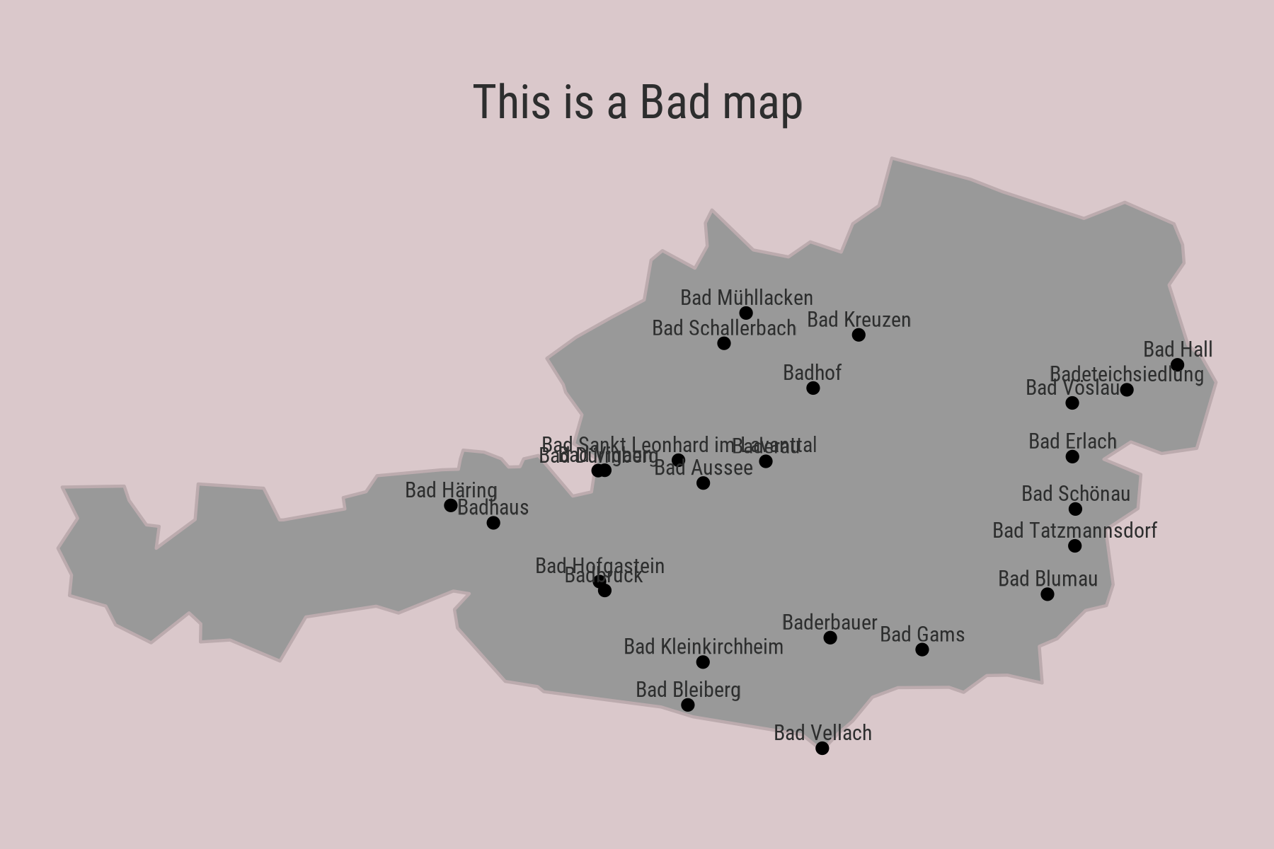
Day 11: Red. Bryce Canyon, Utah.
Visualizing Bryce Canyon with rayvista and rayshader.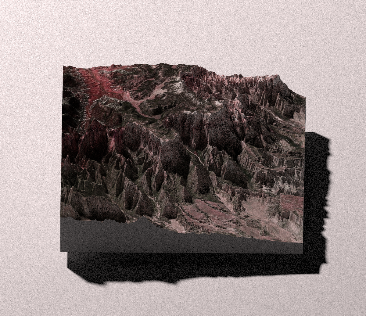
Day 13: 5-minute Map.
A map of San Diego, generated in 5 minutes (4.5 minutes, even).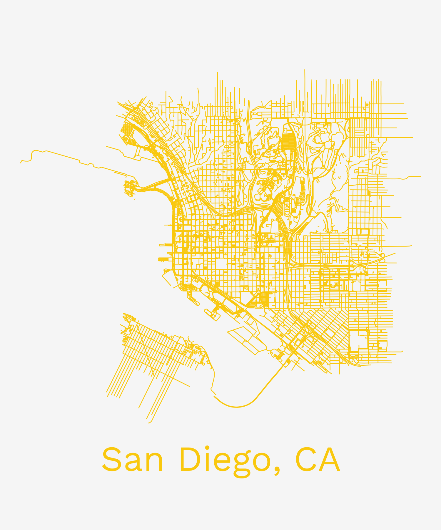
Day 14: Hexagons. London air pollution.
NO2 air pollution particles in London, UK. Data: London Open Data.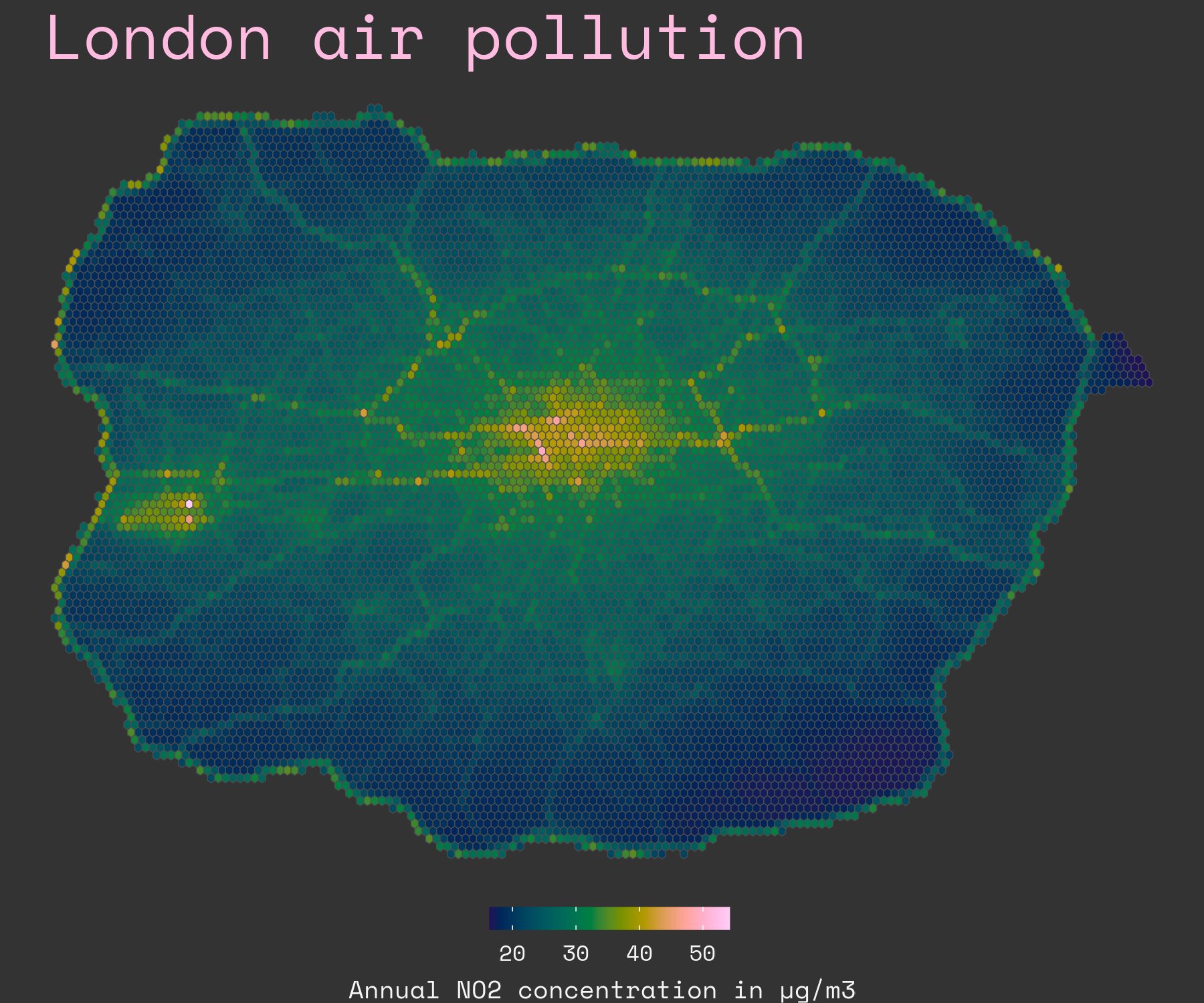
Day 15: Food & Drink.
A sesame cheesecake depicting Rialto Beach, WA.
Day 16: Minimal. Faroe Islands.
Elevation isolines of the Faroe Islands.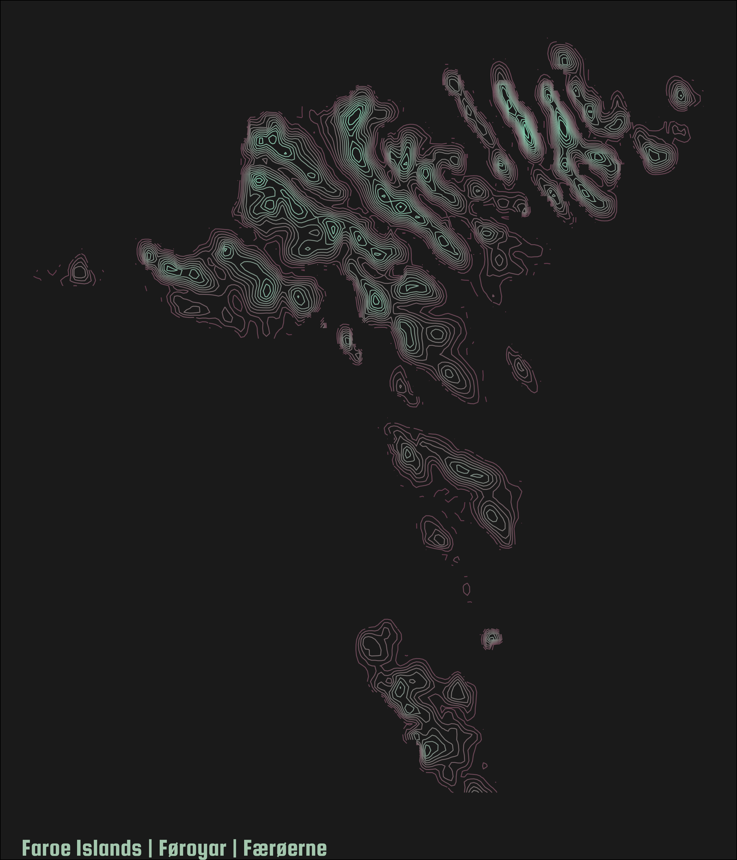
Day 18: Blue. Great Barrier Reef.
Visualizing a part of the Great Barrier Reef in rayshader.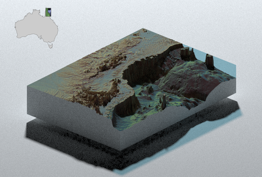
Day 19: Globe. A view from Antarctica.
Emperor penguin population in Antarctica & outside of Antarctica.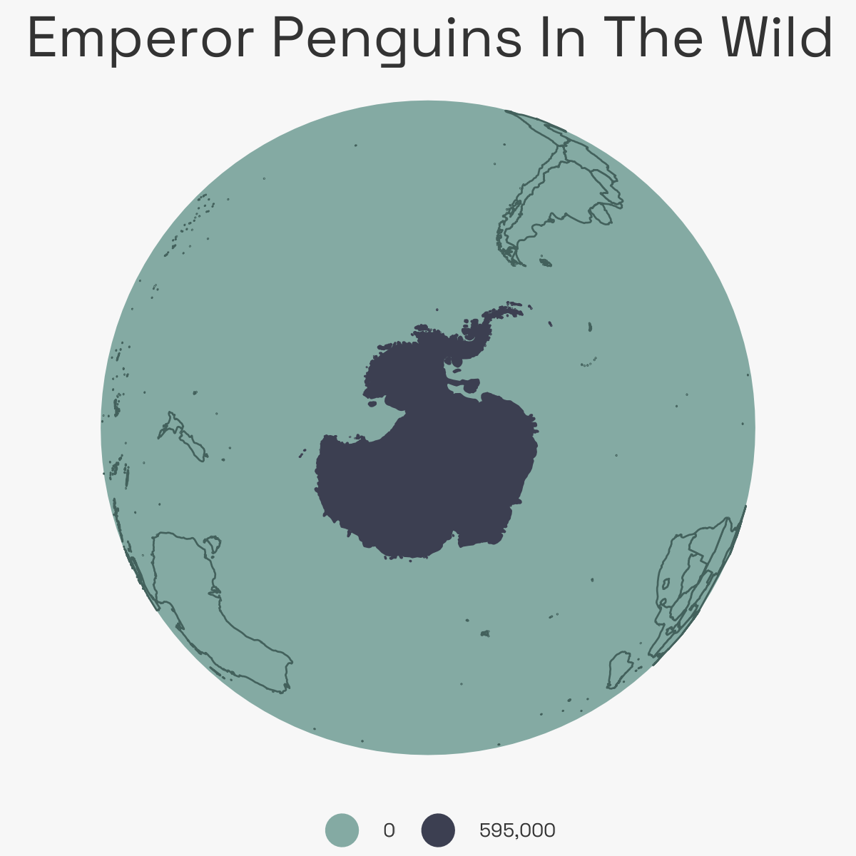
Day 20: My Favourite. My favourite hike of 2022.
Stylized isoline plot of Pollett's Cove, Nova Scotia.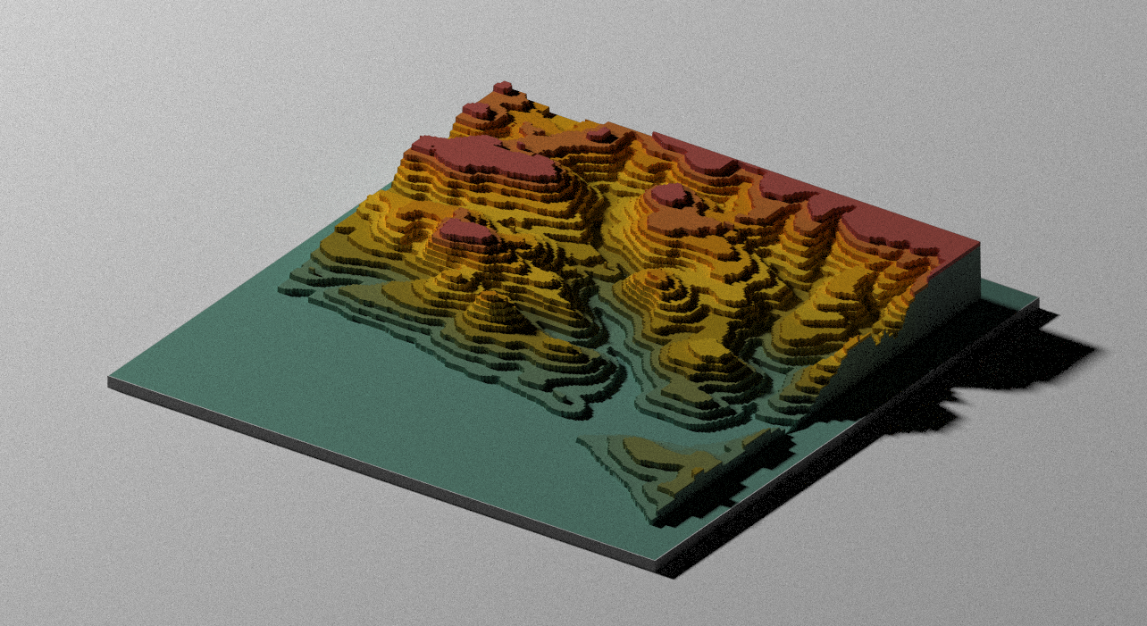
Day 21: Kontur Dataset. Population of Slovenia.
Population density of Slovenia.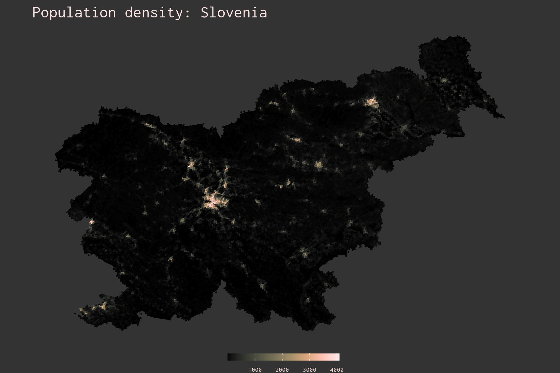
Day 23: Movement. My movement patterns in Toronto.
Google Location history, animated.
Day 24: Fantasy. London Tube, in NYC.
Plotting the London Tube network over NYC. The network is centered on Times Square.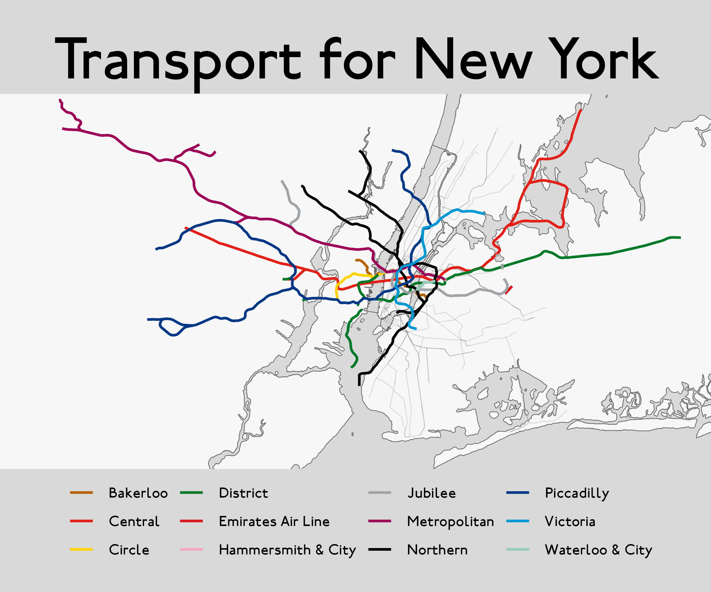
Day 25: Two Colors. Rivers of Europe.
The rivers of Europe - main rivers in thicker green lines and smaller in thinner lines.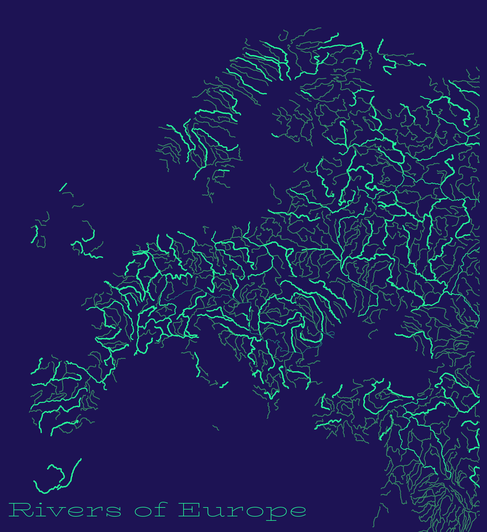
Day 26: Islands.
The Galapagos Islands rendered using rayshader.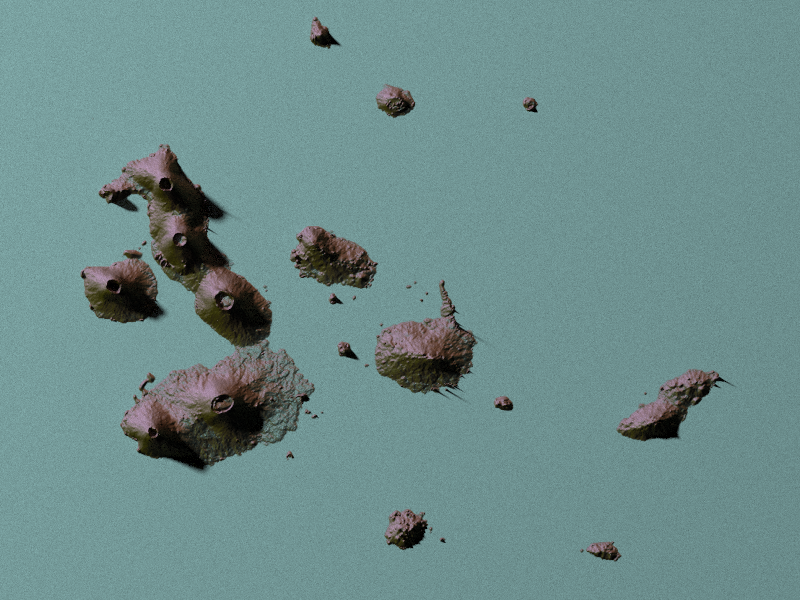
Day 27: Music. Song spectrogram map.
Mapping the spectrogram of Anthem by Leonard Cohen on the map of the world.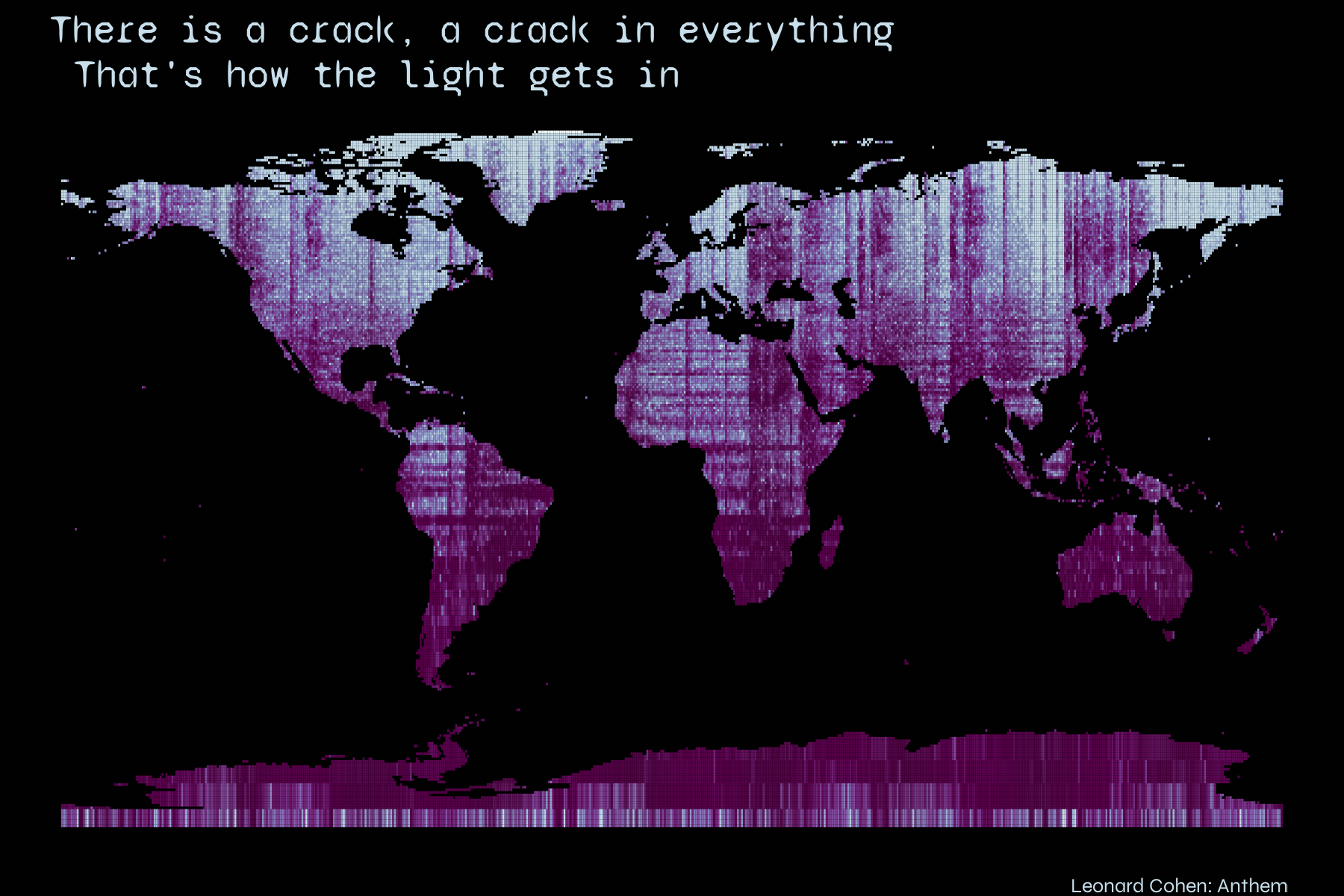
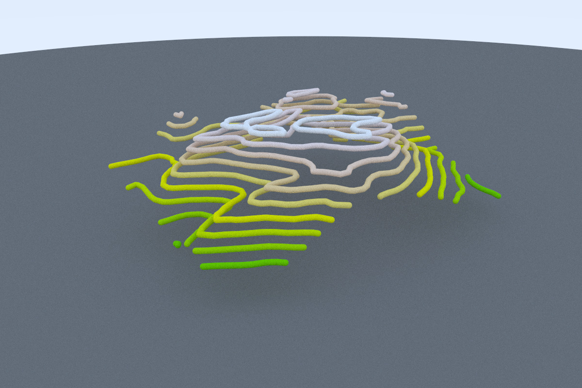
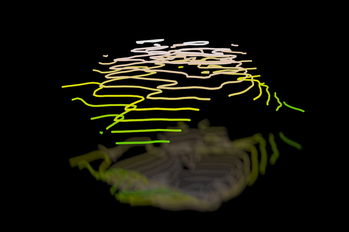
Day 28: 3D. Neon isolines, Torres del Paine.
Visualizing Torres del Paine in the form of neon isolines.Original tutorial: Tyler Morgan-Wall.
Additional code: David Friggens.
Day 29: Out Of My Comfort Zone.
Using Aerialod to map the LIDAR model of downtown Toronto.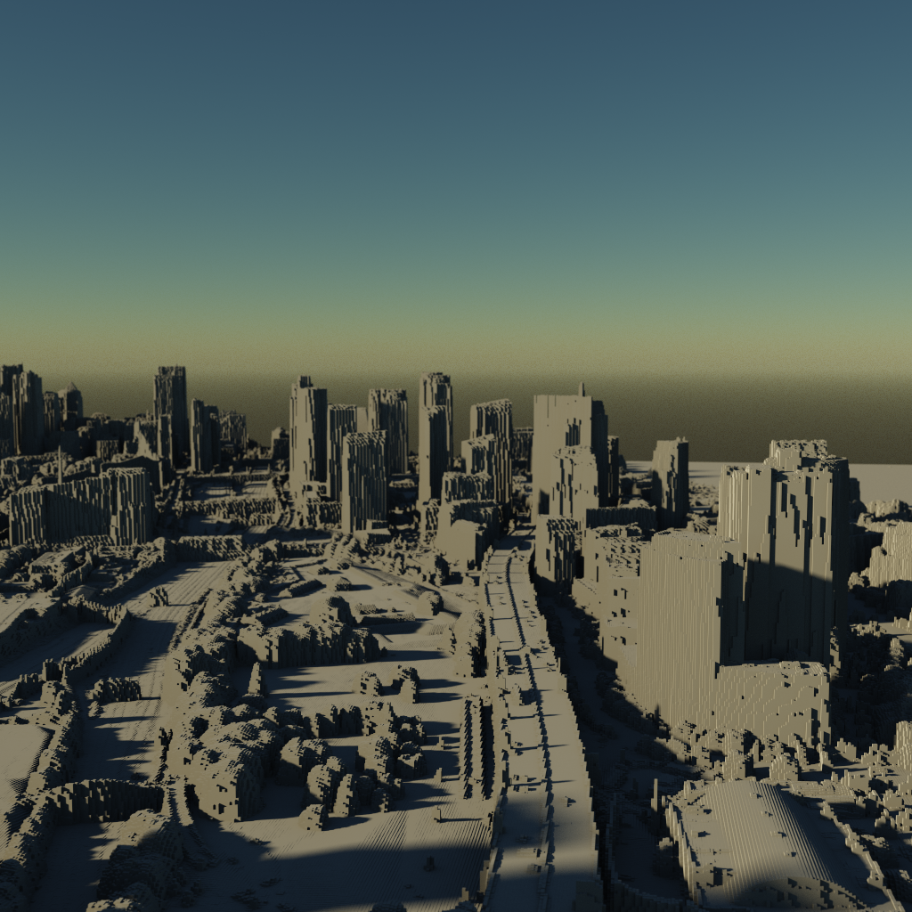
Day 30: Remix.
Plotting Ljubljana, my home town, using prettymaps in Python.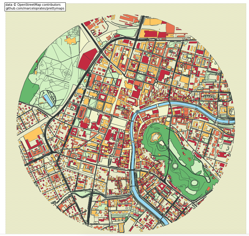
That's it! I'm proud of the progress I've made since last year and excited to learn more in the future.